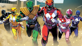
Another month has passed, and after the bombastic introduction from the first issue, it’s time to see whether it formed a solid foundation for the series going forward. The popular argument within the world of comics is that the first issue can be your toughest because you want to hook readers in, but I will counter that it’s the second issue and future chapters that are even more critical, because you want to prove to your audience that you can maintain a expected, consistent level of quality over stretches of thirty days. So let’s see how Kyle Higgins and Hendry Prasetya handle their second issue.
I see a hint of Morrison-era X-Men influence as Higgins weaves all the interlocking plot lines and melodrama into one coherent story. Granted, this could be my personal X-Men bias peeping in, but I have to give credit to Higgins with his ability to make it all an entertaining story, I’ve seen many comic writers on various team franchises attempt to write in the vein of Chris Claremont and fail. Even though the Power Rangers aren’t as big of a group as the X-Men, the group dynamics are similar enough to justify the comparison.
One other aspect that Kyle Higgins takes advantage of his now “unlimited budget” and being unbeholden to previously recorded Sentai footage. A perfect example of this is during the opening scene, which at it’s core is a character building moment between Billy and Trini and what his purpose on the team is now that Tommy is part of the inner circle. Having this scene take place within the Dragon Zord itself adds to world that the Rangers live and because it feels cooler to see that scene in that setting as opposed to at Ernie’s Juice Bar.
Unlike the previous issue, Kyle Higgins packs this issue with action throughout the middle act, and Hendry Prasetya delivers dynamic action sequences that flow effortlessly from panel to panel. Not only did Prasetya deliver great fight pages, but his art in this issue is an improvement overall. His line work doesn’t look as erratic, and his facial expressions feel more lively than before. The best character moment for Prasetya was a simple three panel sequence when Jason tries to console Tommy after their fault, and you can feel Tommy’s aggression by his body posture. Hopefully going forward the art quality remains this high.
The backup feature, written by Steve Orlando and art by Matt Herms continues to be absolutely delightful. Even though it’s only two pages, it serves as the perfect palate cleanser to the main story. Overall, Mighty Moprhin Power Rangers #2 managed to maintain an expected quality of excellence, with the biggest improvement being Hendry Prasetya’s art and the minor nuances that enhance the dramatic story.
Mighty Morphin Power Rangers #2 earns a 4/5
